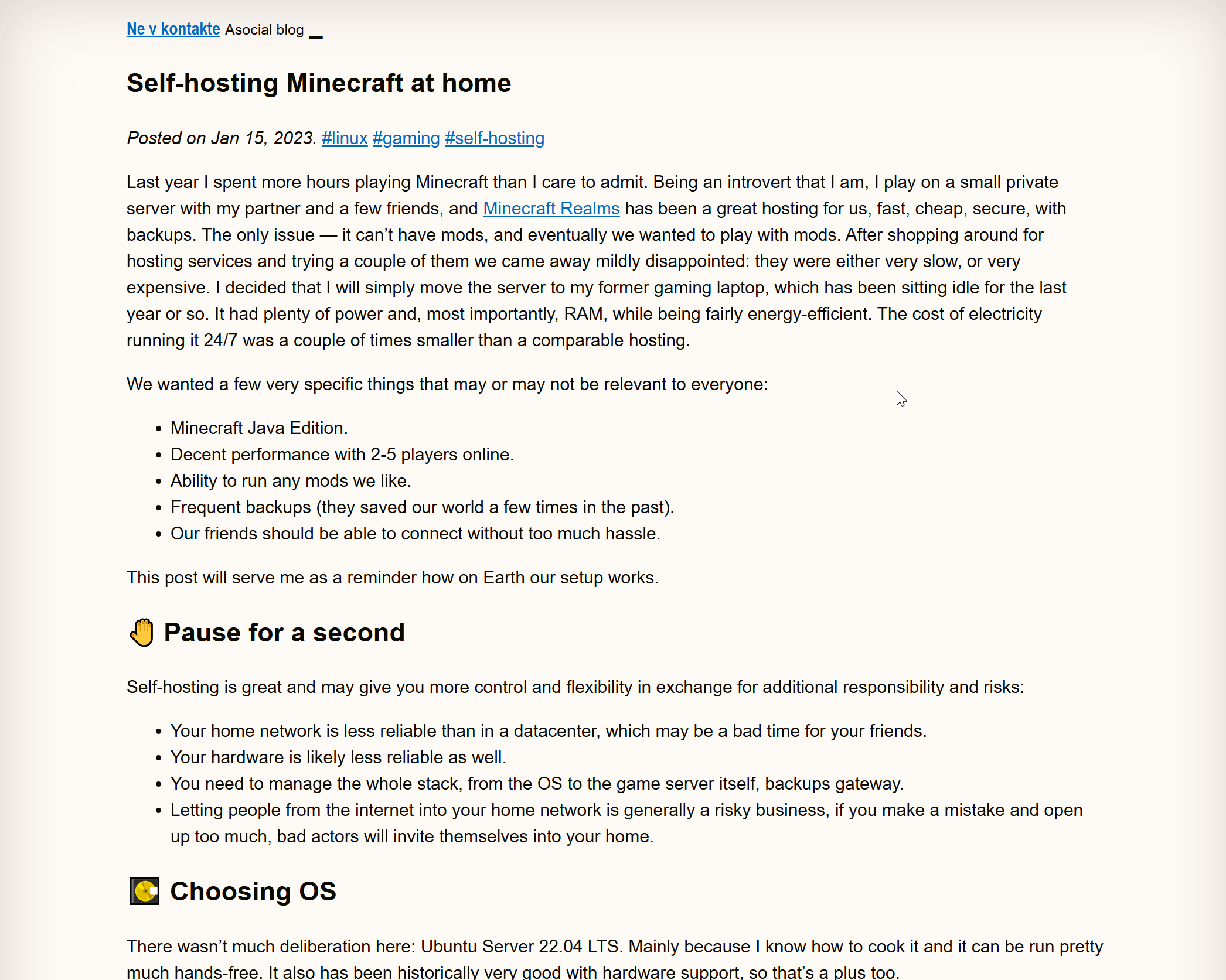
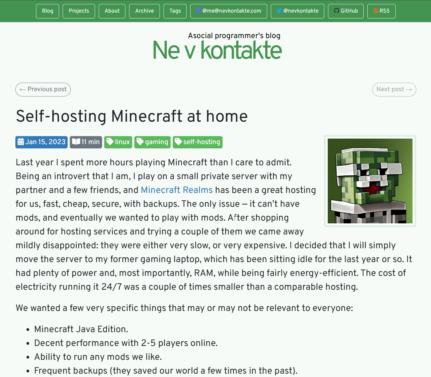
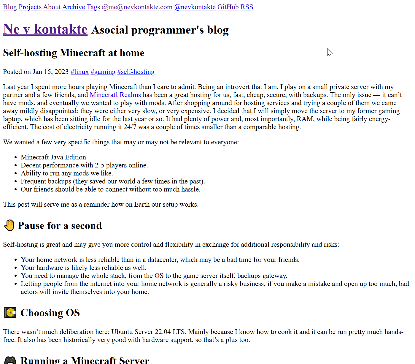
Thinking more on web #decluttering, I now believe that this is largely a matter of control.
My programming career started in web development and even though I was never good at the design part, it was always immensely satisfying to get my web site look just right. Perfect margins, best color scheme, nicest fonts, but all of it according to me.
Herein lies the problem: web sites are largely created to represent the tastes (or corporate style) of the creators, and not the preferences of visitors. I think that the key to a user-firendly web is giving back the control to the users.
The hard part of it is how much control should we give back. In the attachment are three versions of the same blog post: one with my current blog's theme (the green one, designed according to my tastes), one with all styles stripped off (literally zero custom CSS), and the second is the very minimal styling (mostly browser defaults, but some minimal styling to improve readability).
Which one is better for the user? I dunno.
So, giving back all control isn't really viable today, the browsers won't extend that control to the user, and even when they do, most users won't know how to take advantage of it.
So, maybe we could help a little? Set a legible text size, limit line length to something easy for the eye to follow, make sure contrast between foreground and background is not too jarring, provide an alternate palette for the dark mode. And wow, that's a lot of opinionated choices already. Should you provide 2, 4, 12 color themes to suit varying tastes, lighting conditions and screen types? Would the user mind having to pick the stylesheet every time they enter a new site?
That's a bit of a mess.
I also conducted a scientific study on a sample of 1 and shown the "original design" and "minimally styled" versions side by side to my partner. She actually didn't care much for the minimal option, preferring green colors and the blocky font of the original theme I mean, I'm kind of pleased because I tried very hard to make it look pretty while not being obnoxious, but does it just mean I'm a weirdo who complains at pretty things?
All that said, most modern browsers support some kind of "reader mode" that basically does just chuck all the site-specific styling into the trash bin and shows the content the way the user prefers. Some implementations are better than others, but given the wide spread of this feature, isn't it reasonable to assume there is demand for it after all?
So maybe what I'm saying is that browsers should provide web developers with some tools to show their sites in a reader mode by default? Even something simple like a set of standard css variables that convey user's reader style would already be great. And a way make adjusting the settings easy for the visitor.


I think in theory, the style-less one should be best: because it honors the defaults the user set in their browser. Bigger text size? Different default font? Change background and text color? No problem, whatever you specify in the browser settings. Weird screen size? Just resize your browser window however you like.
Of course, it doesn't work like that in practice. I asked a few non-techie friends, none of them realized that you can configure that kind of thing in their browser. And why would they, none of the web sites they normally visit would honor those, enforcing their own aesthetics. Say thanks if they allow you to choose between a dark and light modes.
Some browsers don't even give you an option — Safari on iOS, as far as I could tell, only allows you to control the default page zoom, and that's it.